
“Choosing a color isn’t a matter of taste; it’s a matter of strategy. I’ve seen countless projects where color is treated as an afterthought—a subjective choice that ‘feels right.’ But great design doesn’t guess. It communicates.
It uses the science of color theory to evoke precise emotions and guide behavior. We took a single hex code—the soft, elegant lavender #daceed—and subjected it to a full scientific and psychological analysis.
What follows is a masterclass in building intentional, harmonious, and powerful color palettes from the ground up. This is how you move from simply picking colors to designing with purpose. Dive in.” — JAKE CANO
I HAVE NO SHAME, this report was created in Gemini by using the following Deep Research inquiry:
Before constructing harmonious color palettes, a rigorous foundational analysis of the base color is imperative. This initial deconstruction provides the quantitative and qualitative data necessary for the scientific application of color theory. The hexadecimal code #daceed serves as the starting point for a comprehensive exploration into its constituent properties, perceptual characteristics, and psychological impact.
Color in digital media is represented through various models, each serving a distinct purpose.[1, 2] While the hexadecimal (Hex) format is a compact code used widely in web development and computing applications, other models like RGB (Red, Green, Blue) and HSL (Hue, Saturation, Lightness) are essential for screen rendering and theoretical manipulation, respectively.[3, 4, 5] The Hex code #daceed is composed of three two-digit bytes representing the intensity of red (DA), green (CE), and blue (ED).[2, 3] Converting this code into more descriptive models is the first step in our analysis.
This technical breakdown reveals that #daceed is a light, moderately soft, cool color, providing the precise numerical inputs required for generating scientifically derived color palettes.
| Color Model | Value | Description |
|---|---|---|
| Hexadecimal | #daceed | A six-digit hexadecimal number used in web and digital design.[3] |
| RGB | rgb(218, 206, 237) | Additive model for screen displays based on Red, Green, and Blue light intensity.[6] |
| HSL | hsl(257, 48%, 87%) | Perceptual model based on Hue, Saturation, and Lightness, ideal for color theory calculations.[3] |
Beyond its numerical definition, #daceed possesses distinct qualitative characteristics. Its hue of 257° places it firmly in the purple family, while its high lightness and moderate saturation give it a soft, gentle appearance.
Based on these properties, #daceed can be perceptually identified as a shade of lavender or pale violet.[7, 8] Its high lightness (L: 87%) and relatively low saturation (S: 48%) also firmly place it within the pastel color category. Pastels are defined as colors with high lightness and low saturation, often created by adding white to a pure hue (a process known as creating a tint).[5, 6, 9] This classification is not merely descriptive; it is fundamental to understanding the color’s psychological profile and the challenges of pairing it with other colors.
The psychological impact of a color is a critical consideration in design, influencing mood, perception, and even behavior.[10, 11, 12] The emotional response to #daceed is layered, stemming from its identity as a purple, its specific shade of lavender, and its classification as a pastel.
A truly scientific approach to color selection moves beyond simple calculation to address the complex interplay between mathematical rules and human perception. Two primary considerations arise from the analysis of #daceed that will inform all subsequent palette generation.
First, the base color is a pastel, which is psychologically calm and gentle.[9] However, standard color harmony rules, when applied purely mathematically, often generate complementary or triadic colors that are, by default, highly saturated and vibrant. Pairing a high-energy, vivid color with a soft, tranquil pastel can create a jarring visual and psychological dissonance. A sophisticated and genuinely harmonious palette, therefore, requires more than just calculation; it demands a deliberate adjustment of the generated colors’ saturation and lightness to align with the pastel nature of the base color. This process transforms a mechanical application of rules into a nuanced, expert-level design task.
Second, the request for a “scientific” selection implies adherence to the principles of modern design science, which prominently includes accessibility.[18, 20] The base color #daceed has an extremely high lightness value of 87%. This means it provides very poor contrast against a white background (L: 100%) and other light colors. According to Web Content Accessibility Guidelines (WCAG), this makes it unsuitable for use as text or for critical user interface (UI) elements that must be easily legible.[18] A scientific analysis must therefore evaluate each generated palette for accessibility, specifically the contrast ratios between colors. It must also provide clear guidance on how to use the palettes in a compliant manner, for example, by reserving the darkest colors for text and the lightest colors for backgrounds.
The monochromatic color scheme is the most fundamental and unified of all color harmonies. It is created by using a single base hue and exploring variations of that hue by altering its saturation and lightness.[6, 21, 22] This approach results in a palette that is inherently cohesive and visually harmonious.[23]
To generate the monochromatic palette for #daceed, we use its base hue of 257° as a constant and systematically vary the saturation (S) and lightness (L) values. This creates a range of related colors, including tints, shades, and tones.[24]
By selecting a range of these variations, we can build a versatile palette that provides enough contrast for practical use while maintaining a unified aesthetic. The following table presents a five-color monochromatic palette derived from #daceed.
| Role | Hex Code | RGB Value | HSL Value | Description |
|---|---|---|---|---|
| Lightest Tint | #f5f2fa | rgb(245, 242, 250) | hsl(257, 67%, 96%) | An extremely light tint, suitable for backgrounds. |
| Light Tint | #e9e3f5 | rgb(233, 227, 245) | hsl(257, 56%, 93%) | A soft tint for larger, non-critical background areas. |
| Base Color | #daceed | rgb(218, 206, 237) | hsl(257, 48%, 87%) | The original color, serving as the main theme hue. |
| Dark Shade | #837894 | rgb(131, 120, 148) | hsl(257, 11%, 53%) | A darker shade with sufficient contrast for sub-headings or UI elements. |
| Darkest Shade | #383241 | rgb(56, 50, 65) | hsl(257, 13%, 23%) | The darkest shade, providing high contrast for body text and critical icons. |
Monochromatic color schemes are widely regarded for their ability to create a sense of calm, elegance, sophistication, and order.[22, 23, 26] The emotional impact is primarily driven by the base hue.[23] Since the base hue is lavender, this monochromatic palette evokes feelings of tranquility, professionalism, and soothing comfort.[22] The overall effect is one of understated luxury and clean minimalism.
In practical application, this palette is exceptionally well-suited for corporate branding, professional websites, and UI/UX design where clarity and focus on content are paramount.[22, 23] The low visual clutter of a monochromatic scheme allows typography, imagery, and key information to stand out without competing with a complex color background.[24] It is a timeless choice that can convey trust and reliability, making it popular for financial, tech, and wellness brands.[22]
While elegant, a primary challenge of monochromatic design is the risk of it appearing monotonous, flat, or visually uninteresting.[22, 27] Furthermore, if the shades and tints are too similar in value, the lack of contrast can severely hinder readability and fail accessibility standards.[22, 28]
A scientific and strategic application of this palette directly addresses these challenges. The key is to ensure a wide range of lightness values within the palette. The generated palette in Table 2 was constructed with this principle in mind. By using the lightest tints, such as #f5f2fa (L: 96%), for main backgrounds and the darkest shade, #383241 (L: 23%), for body text, a designer can achieve a WCAG-compliant contrast ratio while maintaining the sophisticated, unified aesthetic. The mid-range colors can then be used for cards, containers, and secondary UI elements. This approach transforms a potential weakness of the monochromatic scheme into a strength, creating a design that is simultaneously harmonious, visually structured, and functionally accessible for all users.
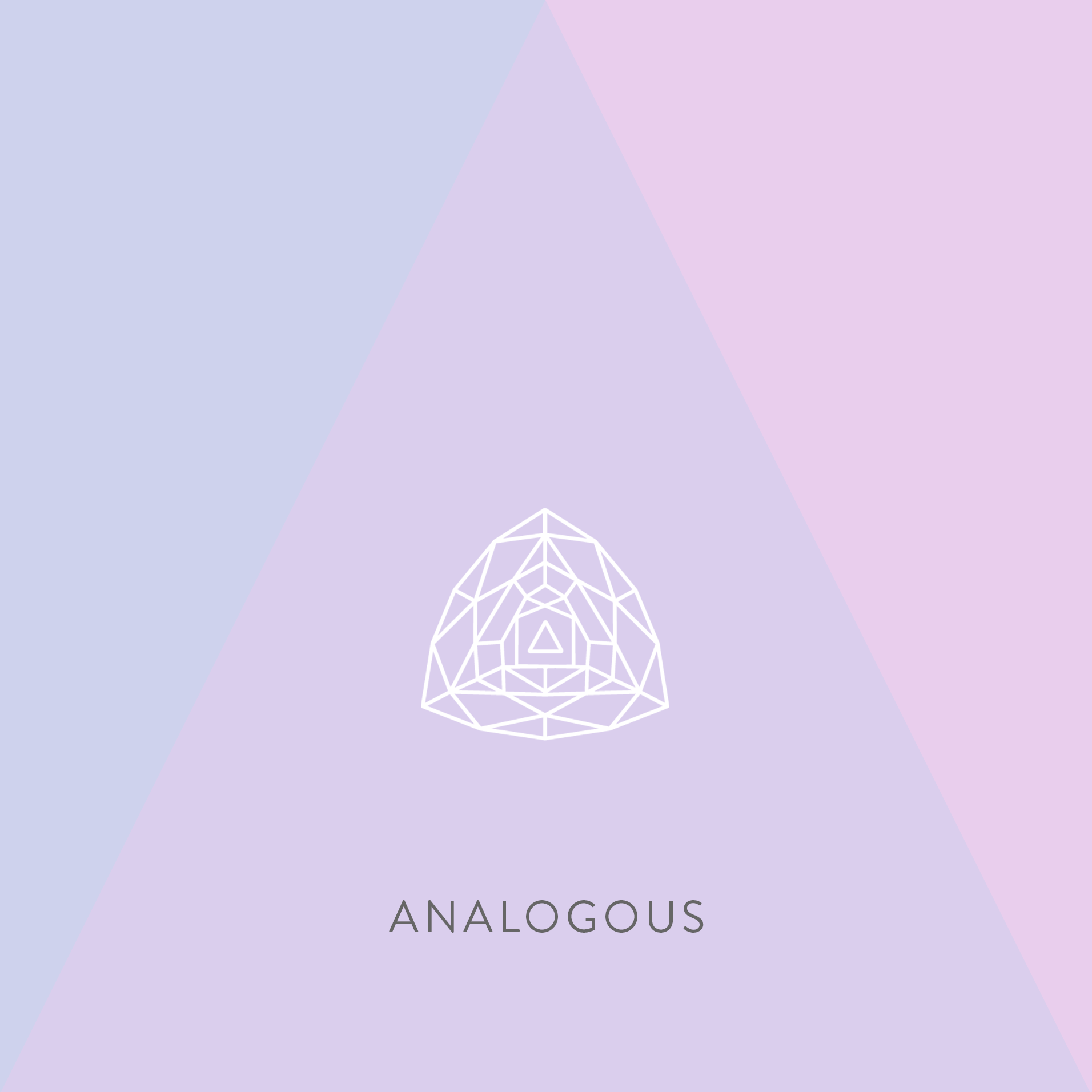
Analogous color schemes are composed of colors that sit next to each other on the color wheel.[5, 10] This proximity creates a natural and seamless relationship between the hues, resulting in palettes that are known for their serene and comfortable feel. They are often found in nature, such as in the shifting colors of a sunset or the varied greens of a forest, which contributes to their inherently pleasing quality.[6]
An analogous palette is typically generated by selecting a base color and the two colors on either side of it. A common method is to shift the hue of the base color by a set angle, such as ±30°, to find its neighbors.
Starting with the base hue of #daceed at 257°, we apply this rule:
To maintain the gentle, pastel mood established by the base color, the saturation and lightness of the new hues are kept similar to the original #daceed (S: 48%, L: 87%). This ensures the resulting palette feels cohesive and shares the same soft character.
| Role | Hex Code | RGB Value | HSL Value | Description |
|---|---|---|---|---|
| Cool Neighbor | #ced2ed | rgb(206, 210, 237) | hsl(227, 48%, 87%) | A soft, cool, periwinkle blue. |
| Base Color | #daceed | rgb(218, 206, 237) | hsl(257, 48%, 87%) | The central lavender hue. |
| Warm Neighbor | #e9ceed | rgb(233, 206, 237) | hsl(287, 48%, 87%) | A soft, gentle magenta-purple. |
The primary psychological effect of an analogous color scheme is one of harmony, peace, and tranquility.[10] Because the colors are closely related, the eye transitions between them smoothly, creating a low-stress, comfortable, and aesthetically pleasing visual experience.[6] The palette derived from #daceed, combining soft blues and purples, is particularly calming and serene. It evokes a sense of gentle creativity, peacefulness, and quiet sophistication.
In application, analogous palettes are exceptionally well-suited for designs that aim to create a relaxing and welcoming atmosphere. They are ideal for wellness apps, spa websites, lifestyle blogs, and any brand that wants to project a calm and approachable image. They also work beautifully for creating subtle gradients, background textures, and decorative illustrations where a rich, multi-hued effect is desired without strong visual contrast.[28]
The greatest strength of an analogous palette—its inherent low contrast—is also its most significant weakness in a functional design context.[28] The similarity in hue and value among the colors makes them poor choices for differentiating interactive elements, such as buttons or links, and for ensuring text is legible against the background. Using these colors interchangeably for text and UI controls would result in a design that is difficult to navigate and fails accessibility standards.
Therefore, the expert application of an analogous palette requires a specific strategy. Instead of using the three colors to define separate functional elements, they should be treated as a single, unified group. This palette is best used to create a rich, layered background or a gentle, flowing gradient. Upon this serene foundation, a high-contrast accent color—perhaps a dark shade from the monochromatic palette or a carefully chosen complementary color—should be used for all text, calls-to-action, and critical interactive elements. This approach leverages the harmonious beauty of the analogous scheme for the overall aesthetic while ensuring the design remains functional, legible, and accessible. It separates the palette’s role into aesthetic (background) and functional (foreground), solving the low-contrast problem effectively.
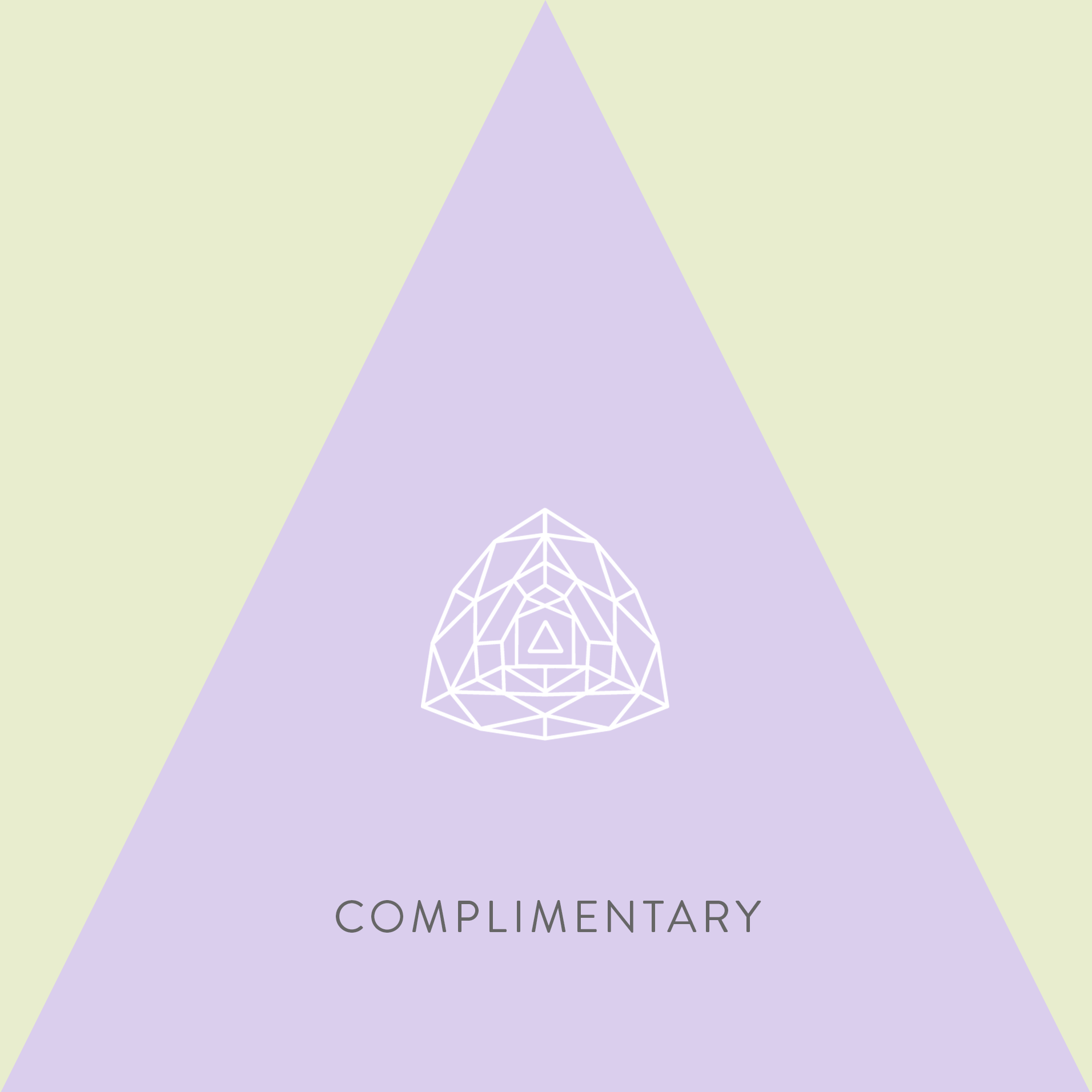
A complementary color harmony is one of the most powerful and fundamental relationships in color theory. It is formed by pairing two colors that are located directly opposite each other on the color wheel.[6, 10] This opposition creates the maximum possible contrast between hues, resulting in a combination that is inherently dynamic, bold, and attention-grabbing.
The complementary color is found by taking the hue of the base color and shifting it by 180°. This mathematical relationship ensures a perfect opposition.
For the base color #daceed, with a hue of 257°, the calculation is:
A hue of 77° falls within the yellow-green range of the color wheel. To create a direct mathematical complement, we initially keep the saturation and lightness values the same as the base color (S: 48%, L: 87%). This results in a very light, pastel yellow-green.
| Role | Hex Code | RGB Value | HSL Value | Description |
|---|---|---|---|---|
| Base Color | #daceed | rgb(218, 206, 237) | hsl(257, 48%, 87%) | A cool, calm, and soft lavender. |
| Complementary Color | #e8edce | rgb(232, 237, 206) | hsl(77, 48%, 87%) | A warm, gentle, pastel yellow-green. |
Complementary color schemes are defined by their high contrast, which makes them visually stimulating and energetic.[5, 10] This pairing naturally draws the eye and makes elements “pop”.[6] The psychological mood is one of dynamism, excitement, and vibrancy. However, this high energy comes with a caveat: if the two colors are used in equal proportions or at high saturation, the effect can be visually jarring, creating a sense of tension or even discomfort for the viewer.[5, 28] The combination of a cool purple and a warm yellow-green creates a strong temperature contrast, further enhancing this dynamic effect.
In practical terms, the power of a complementary scheme lies in its ability to create a focal point. It is an ideal choice for marketing materials, advertising, and user interfaces where the goal is to draw immediate attention to a specific element.[28] The best practice is to use one color as the dominant background color and the other as a sparse but powerful accent.[21] For this palette, the calm #daceed would serve as the primary color for the majority of the design, while the energetic yellow-green #e8edce would be reserved for critical calls-to-action (CTAs), buttons, links, or important notifications.
The pairing of a soft, calm pastel like #daceed with a vibrant, high-energy complement presents a classic design challenge. To create a palette that is both impactful and sophisticated, two expert principles must be applied.
First is the Dominance Principle, often expressed as the 60-30-10 rule.[18, 29] To avoid a jarring visual clash, the base color (#daceed) should dominate the design, covering 60% to 90% of the visual space. This establishes a calm and serene overall mood. The complementary color should be used as an accent for only 10% or less of the design, providing targeted bursts of energy that guide the user’s eye without overwhelming it.
Second, the nature of the complement itself can be adjusted. The mathematically generated complement in Table 4 is a pastel, which creates a soft, gentle contrast. However, a designer seeking more energy could increase the saturation of the yellow-green, making it more vibrant. Conversely, to create an even more subdued and elegant palette, a designer could further decrease the saturation of the complement. This conscious adjustment of the generated color’s properties allows for fine-tuning the palette’s mood. By applying the dominance principle and thoughtfully modulating the accent color, a designer can harness the power of complementary contrast while creating a balanced, professional, and psychologically effective design.
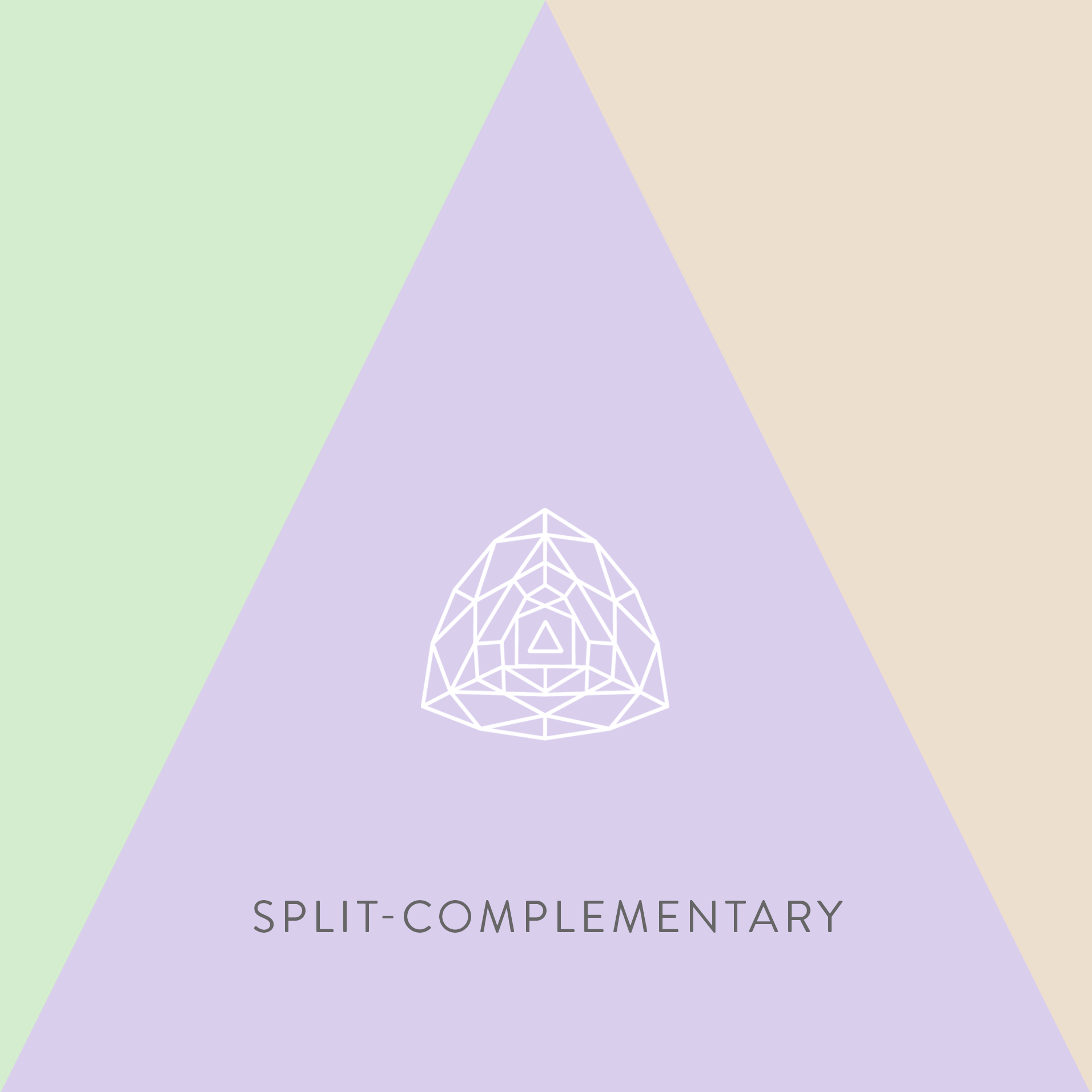
The split-complementary color scheme is a sophisticated and highly favored harmony in modern design. It offers a compelling balance between the high-impact contrast of a complementary scheme and the stability of other harmonies.[30, 31] Instead of using the direct opposite of a base color, this scheme uses the two colors that are adjacent to its complement.[32, 33]
This three-color harmony is generated through a clear geometric relationship on the color wheel. The process involves three steps:
This results in a palette containing the base lavender, a warm yellow-orange, and a cool green. To maintain the pastel character, the saturation and lightness are initially kept consistent with the base color.
| Role | Hex Code | RGB Value | HSL Value | Description |
|---|---|---|---|---|
| Base Color | #daceed | rgb(218, 206, 237) | hsl(257, 48%, 87%) | The cool, soft lavender anchor. |
| Warm Accent | #eddfce | rgb(237, 223, 206) | hsl(47, 48%, 87%) | A warm, gentle yellow-orange. |
| Cool Accent | #d4edce | rgb(212, 237, 206) | hsl(107, 48%, 87%) | A cool, fresh, soft green. |
The split-complementary scheme is widely praised by designers for its ability to create a palette that is simultaneously dynamic, vibrant, and balanced.[30, 34] It provides strong visual contrast but with significantly less tension than a direct complementary pairing.[31, 33] The resulting mood is energetic, stylish, and eye-catching, yet harmonious and inviting.[32] This makes it one of the most versatile and effective color harmonies for a wide range of applications.
This scheme is particularly powerful in UI and UX design.[32, 33] It allows for a clear and intuitive visual hierarchy. For example, the base color (#daceed) can be used for the main background and layout elements. One of the split-complements (e.g., the cool green #d4edce) can be used for secondary information, icons, or active states. The other, more contrasting split-complement (the warm yellow-orange #eddfce) can be reserved for primary calls-to-action, ensuring they stand out effectively. This scheme is often considered a safer, more sophisticated choice for achieving high contrast than a direct complementary palette, making it suitable for both novice and expert designers.[35]
A key characteristic of the split-complementary harmony is that it inherently includes both warm and cool colors.[30, 36] The palette for #daceed contains one cool base color (lavender), one cool accent (green), and one warm accent (yellow-orange). This presents a powerful opportunity for a designer to consciously control the overall emotional tone of a project.
By applying the 60-30-10 dominance principle, the designer can choose which temperature to emphasize.[29, 37] If the design uses the cool lavender and green for the majority of the space (e.g., 60% lavender, 30% green), the overall mood will be calm, serene, and professional, with the warm yellow-orange providing small, energetic pops of visual interest. This would be suitable for a health or finance application. Conversely, if the warm yellow-orange is given a more prominent role (e.g., 30%), the design will feel more cheerful, optimistic, and energetic, while still being anchored by the calming lavender base. This demonstrates how the same set of three colors can be used to create vastly different psychological effects, showcasing a mastery of color theory that goes beyond simple selection to strategic implementation.
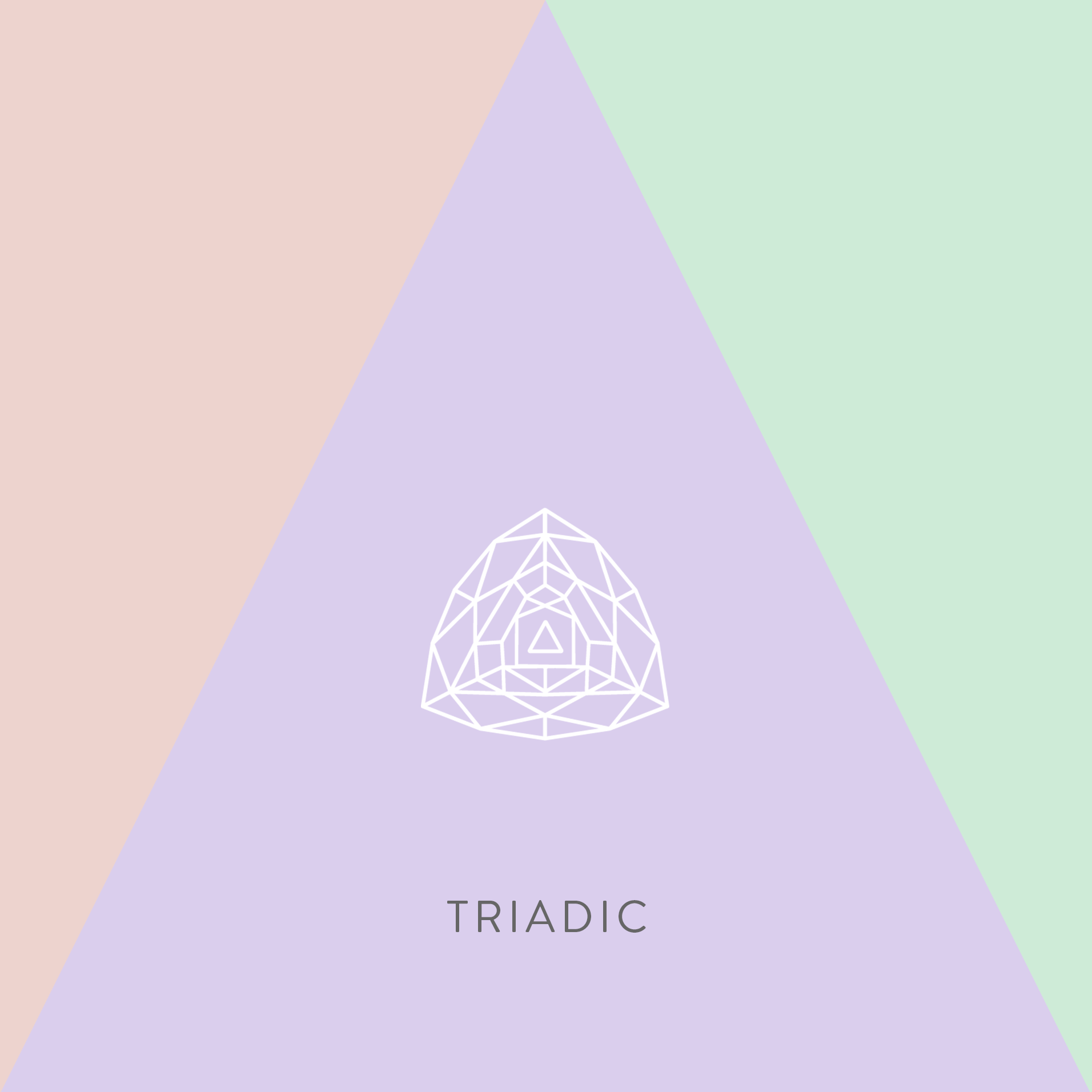
The triadic color scheme is a vibrant and energetic harmony created by selecting three colors that are evenly spaced around the color wheel.[5, 21] These three hues form an equilateral triangle on the wheel, a geometric relationship that ensures a high degree of contrast while maintaining a sense of balance and harmony.[38, 39]
A triadic palette is calculated by taking the hue of the base color and shifting it by 120° in both directions. This places the three colors at equidistant points on the 360° wheel.
Starting with the base hue of #daceed at 257°, the calculations are:
The resulting palette is a combination of the base lavender, a soft green, and a gentle reddish-orange. As with previous harmonies, the saturation and lightness are initially kept consistent to produce a cohesive pastel triad.
| Role | Hex Code | RGB Value | HSL Value | Description |
|---|---|---|---|---|
| Base Color | #daceed | rgb(218, 206, 237) | hsl(257, 48%, 87%) | The cool, sophisticated lavender base. |
| Cool Accent | #ceebd7 | rgb(206, 235, 215) | hsl(137, 48%, 87%) | A cool, fresh, and gentle green. |
| Warm Accent | #edd3ce | rgb(237, 211, 206) | hsl(17, 48%, 87%) | A warm, soft, and inviting reddish-orange. |
Triadic color schemes are known for creating a visual experience that is vibrant, dynamic, playful, and full of energy.[5, 39, 40] The strong contrast between the three distinct hues captures attention and creates a lively atmosphere.[41] Despite the high contrast, the equidistant geometric relationship provides an underlying sense of balance and harmony, preventing the palette from feeling completely chaotic.[39, 42, 43]
The mood of a triadic scheme can be modulated by adjusting saturation. When used with highly saturated colors, the effect is bold and intense. The pastel triad generated here, however, produces a softer, more cheerful, and friendly mood. It feels creative and expressive without being overwhelming.
This type of palette is exceptionally well-suited for designs that need to be engaging and memorable. It is often used in branding for creative agencies, marketing campaigns, children’s products, and any context where a sense of fun and dynamism is desired.[40] To maintain visual order, it is almost always recommended to follow the dominance principle: let one of the three colors serve as the primary background color, and use the other two as smaller, balanced accents.[21, 38, 41]
The true versatility of a triadic scheme lies in the strategic selection of the dominant color, as this choice will anchor the entire emotional tone of the design.[38] The same three colors can produce vastly different psychological effects depending on their proportional use.
This ability to pivot the emotional core of the design simply by altering the color proportions makes the triadic scheme an incredibly powerful and flexible tool for the expert designer. It allows for the creation of multiple distinct brand personalities from a single, mathematically harmonious set of colors.
The preceding analysis has systematically deconstructed the base color #daceed and applied five distinct principles of color harmony to generate scientifically derived palettes. Each harmony possesses a unique structure, psychological impact, and set of ideal applications. This final section synthesizes these findings into a comparative framework, providing a strategic model for selecting the most appropriate palette based on specific design goals.
The five generated palettes are not merely a collection of aesthetic options; they exist on a spectrum of visual complexity and emotional intensity. Understanding this hierarchy allows a designer to make a purposeful choice that aligns with the project’s core message.
Across all harmonies, three master principles emerge as essential for successful and scientific color application:
The following table provides a comprehensive summary of the five scientifically generated palettes for #daceed. It serves as a final, actionable reference guide, allowing a designer to compare all options at a glance and select the harmony that best aligns with their project’s strategic objectives.
| Harmony Type | Palette Hex Codes | Hue Count | Contrast Level | Core Psychological Mood | Ideal Use Cases |
|---|---|---|---|---|---|
| Monochromatic | #f5f2fa, #e9e3f5, #daceed, #837894, #383241 | 1 | Low | Calm, Sophisticated, Minimalist, Professional | Corporate Branding, UI for Complex Apps, Professional Portfolios, Content-Heavy Sites |
| Analogous | #ced2ed, #daceed, #e9ceed | 3 | Very Low | Peaceful, Harmonious, Serene, Gentle | Wellness and Spa Brands, Lifestyle Blogs, Background Textures, Decorative Elements |
| Complementary | #daceed, #e8edce | 2 | High | Bold, Energetic, Dynamic, High-Impact | Marketing Accents, Calls-to-Action (CTAs), Highlighting Key Information |
| Split-Complementary | #daceed, #eddfce, #d4edce | 3 | Medium-High | Balanced, Stylish, Engaging, Versatile | Modern UI/UX Design, SaaS Platforms, Creative Agencies, Establishing Visual Hierarchy |
| Triadic | #daceed, #ceebd7, #edd3ce | 3 | High | Vibrant, Playful, Creative, Energetic | Youth-Oriented Brands, Marketing Campaigns, Event Promotions, Game Design |